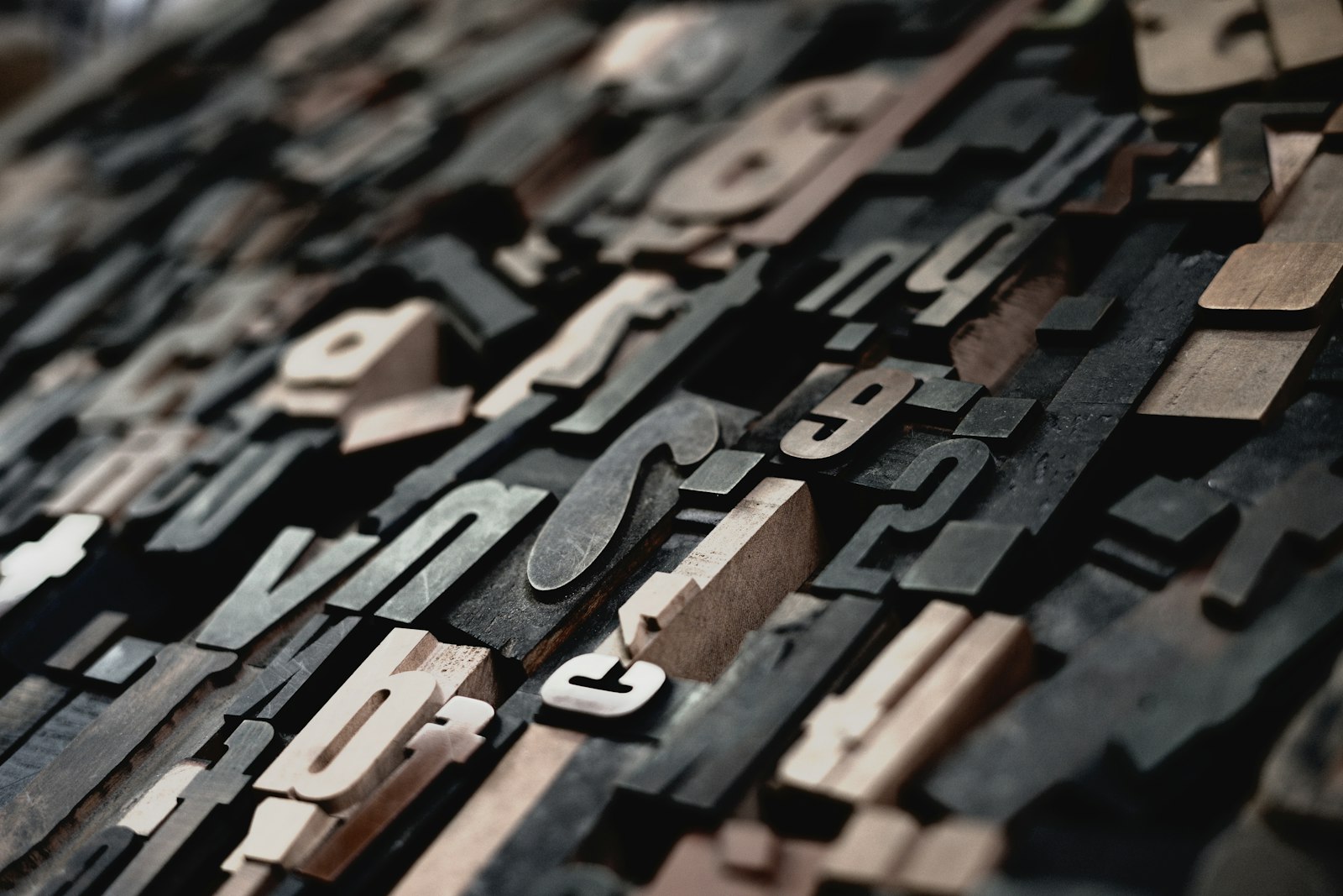
Before anyone reads a word, the typeface has already spoken. A heavy slab feels confident, a delicate serif feels considered, a rounded sans feels friendly. Choosing one is choosing a tone of voice.
For long reading, comfort matters more than personality. Look for generous spacing inside the letters, clear differences between similar shapes such as a capital I, a lower-case l and the number 1, and a size large enough to read without leaning in.
Most good pages use two typefaces at most: one for headings, which can carry more character, and one for the text, which should disappear as the reader reads. More than that, and the page starts to argue with itself.
And give the words room. Line length matters as much as the face itself: lines of fifty to seventy-five characters are the easiest to follow.
















Two typefaces at most. I needed to hear that.