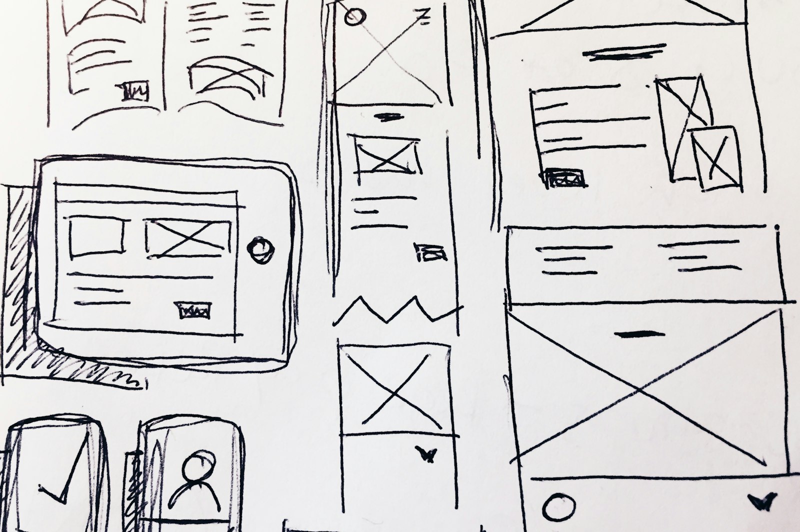
For years, websites were designed for a wide desktop screen and then squeezed onto phones as an afterthought. Many people now read mostly on their phones, and the habit has turned around: design for the smallest screen first, then let the layout grow.
Starting small is a discipline. A phone has room for one column and a handful of things above the fold, so you have to decide what matters most. Those decisions make the larger layouts better too, because the priorities are already clear.
It also changes how you think about touch. Links and buttons need to be large enough for a thumb, with space between them. Menus need to fold away without hiding where they went.
Then widen the canvas and add what the space allows: a second column, a larger image, a sidebar. The page grows; its order stays the same.
















0 Comments