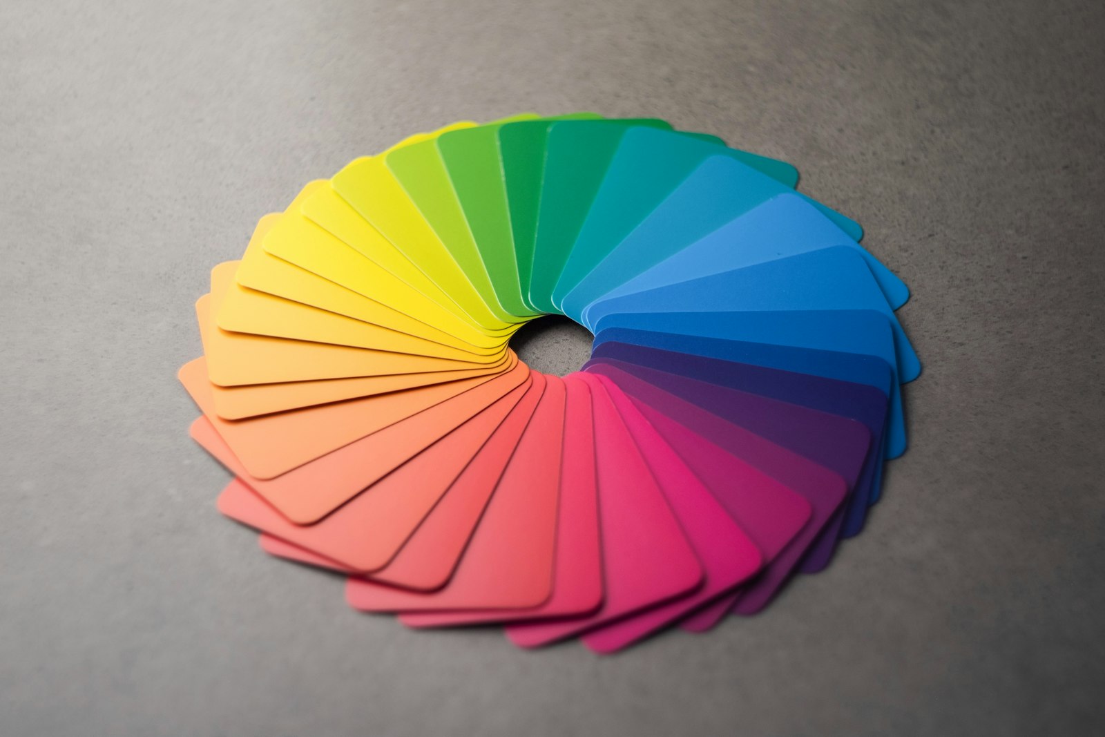
A colour scheme that looks beautiful to you can be unreadable for someone else. Around one in twelve men and one in two hundred women have some form of colour blindness, and many more people read on dim screens or in bright sunlight.
The most useful single check is contrast: the difference in lightness between text and its background. The Web Content Accessibility Guidelines ask for a contrast ratio of at least 4.5 to 1 for normal text and 3 to 1 for large text. Free contrast checkers will tell you the ratio for any pair of colours in seconds.
Two more habits help. Never rely on colour alone to carry meaning: pair red and green with icons or words. And test your palette in greyscale; if two elements become indistinguishable, they need more than a change of hue.
Accessible colour is not a constraint on good design. It is part of what good design means.


















0 Comments